Apple Watch Development, Week 1
John Scalo
25 November 2014
This is the first in what will hopefully be a weekly (or more likely quasi-weekly) dispatch documenting the development of Numerous for Apple Watch.

Apple dropped the WatchKit SDK on Tuesday, Nov 18 so it’s been exactly a week. With the launch of Numerous for iPad we’ve been super busy but couldn’t wait to jump into Apple Watch development and thought it would be fun to document the process.
Charlie and I have talked a lot about how we envisioned Numerous running on the Apple Watch, but with the official release of the SDK we had for the first time the technical specs about what is and what’s not possible. In particular:
- Animations aren’t supported (except via “canned” pre-rendered ones)
- All code must run on the iPhone, not the watch
- Aside from the built-in paged navigation, scrolling is always vertical
- Views cannot be subclassed
You might have noticed there’s a whole lot of “can’t” there and not much “can”. We noticed that too, but this was expected for the first go around of Apple Watch.
In fact, I should pause to mention how cool it is to be developing something for a brand new platform. I thought about it and realized that even though I’ve been making software all of my life, I’ve never done it as part of a brand new platform. (Unless you count Mac OS X but for many that was just a continuation of OpenStep and NeXT).
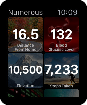
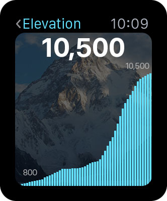
With the limitations in mind we had some email conversations about how Numerous should work on Apple Watch and at a high level agreed: the main view should be a dashboard of your numbers and for any number you should be able tap it to open a “detail” view, not unlike the iOS app.
OK that’s pretty basic and obvious and leaves a lot of open questions:
- Paged UI or a table UI for the main interface?
- Show ALL numbers or just a subset?
- What should we show in the detail view?
- What prefs are needed and where do they go?
- Do we support likes, comments, and number updates from the watch?
That’s just scratching the surface. And before we could begin to answer those questions we needed to get a feel for the Apple Watch so it was time for mockups.
I spent a day in Photoshop and bounced several ideas to Charlie. But something wasn’t right. We had guesses about what would and wouldn’t work but we still weren’t getting a feel for the experience. And then I realized why— Apple recommends that apps have a black background. The Apple Watch bezel (the border around the actual screen) is black. Ah. So Apple intends for the bezel to feel like an extension of the apps running on the watch. The problem is, the template resources that Apple provides for mockups don’t include the bezel at all, so you don’t get a feel for its impact.
That’s solved easy enough. I added the watch bezel to all my mockups and instantly got a feeling for which worked and which didn’t. Except that actually none of them worked. Elements in the UI that stopped at the “screen" edges appeared abruptly cut off when considered with the watch bezel. And the watch’s rounded corners clashed with the sharp squares in my designs. Also, we were trying to cram far too much in each screen whereas the watch’s form factor demands singularly focused content in each view.
We’re not done yet, not even close, but here are two that we like so far:


Follow @Scalo on Twitter
Follow @NumerousApp on Twitter
What are your thoughts about Numerous for Apple Watch? Share them in the comments section below.
