The official blog for Numerous. Life's most important numbers available at a glance.
Design Inspiration
John Scalo
10 November 2013
While Charlie’s first day on the job was Monday of last week, I left my job two weeks earlier and that gave me some extra time to think about design and begin mockups. (BTW, my mockup tool of choice: Photoshop. I own and love Pixelmator but I’ve been using Photoshop since v2.5 so it feels like an old friend.) I could have gone the wireframe route and tried to forego style completely for now but, well, wireframes are boring.
So immediately I’m faced with that primordial design question: What should the app look and feel like? A good place to start seems to be the central focus of the app: numbers. OK, what is the essence of numbers? Hmm. Numbers, numbers, numbers. 1, 3.1415, 99%, $2,000,000. They are themselves emotionless and yet inspire incredible emotion in us (like the last time my checking balance went negative). As great as hot pink looks in an iOS 7 navigation bar, I’m thinking this puts us mostly at the cool end of the color spectrum and away from primary colors. And since a single number can say so much, this points towards minimalism and restraint of whimsy.
With this in mind I look for inspiration. For some reason I’m drawn to the precision of modern German engineering, then to Eastern Bloc graphic design, and then outward through Europe. I surveyed Russian Constructivist posters, Bauhaus, Josef Müller-Brockmann, Otl Aicher, Wim Crouwel, and more. I even went to (gasp!) a real book store and there found a coffee table book featuring, of all things, Romanian movie posters. In it, something jumps out at me:

A Romanian John Wayne movie poster!
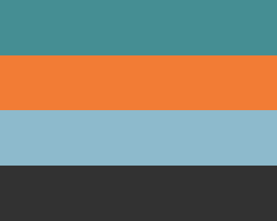
I really like the color palette here:
In fact I’ve been using it for all of my mockups and I think it looks great. Will our final app retain any of this early design inspiration? Maybe, maybe not, but at least it’s a start.